Publication date: August 1, 2023
Author’s note: Product teams at Meta rely on research along with other external factors to design and build products. This article discusses research conducted by Meta's Research Team to better understand people’s privacy needs.
Abstract
When apps ask for permission to access your camera, location, and other system information, it’s known as a “system permission” request. These requests are often subject to standardized design guidelines that provide users with minimal information about how apps use system access and resulting data.
In this research, we explored the impact of introducing “context screens” that provided additional privacy information before system permission requests.
We found that context screens can help users feel more confident in their privacy decisions and can be preferred over presenting system permissions without context screens.
Report
Apps have to ask permission to access your camera, location, and other system information. These requests are sometimes called “system permissions”, and they play a pivotal role in helping users control their privacy.
To help people recognize and trust system permissions, they’re often required to conform to standardized design guidelines (ex: Apple’s requirements for iOS system permissions). While standardization has important benefits, different apps can ultimately use the same permissions in unique ways (ex: some apps may use camera access only to take photos, whereas others may use it to take photos and then process those photos in different ways such as with visual effects). As a result, users may sometimes find it helpful for apps to provide additional context beyond the minimum of what’s included in the standard system permission text.
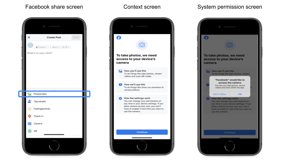
One way that apps can do this is through the use of “context screens” (also known as pre-alert screens). Context screens appear immediately before a system permission and are intended to provide helpful information about why an app is asking for the permission and how the data will be used.
Figure 1. An example of a system permission with a preceding context screen.

Figure caption: If someone hasn’t already provided the Facebook app with camera access, then tapping on “Photo/video” in the Facebook share screen opens the context screen. From the context screen, clicking “Continue” proceeds to the system permission screen.
While context screens can provide useful information, they also increase the time and effort it takes users to complete system permissions. And that might frustrate users who are eager to access a product’s features.
At Meta, we wanted to explore two key questions related to context screens: (1) Can context screens actually boost user confidence in system permissions decisions? (2) Given the tradeoff that context screens present in terms of amount of information versus amount of time and effort, do users ultimately prefer context screens to be included with system permissions or not?
What we did
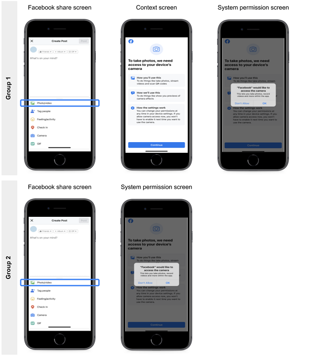
To answer these questions, we surveyed a group of Facebook users through an online survey panel provider. In the survey, each participant was shown a hypothetical design for a system permission experience. Half of the participants were shown a design that included a context screen before the system permission screen. The other half were shown an identical design, except that the context screen was omitted (see Figure 2).
Figure 2. Half of participants saw a system permission paired with a context screen (Group 1), and the other half saw it without a context screen (Group 2).

Figure caption: If someone hasn’t already provided the Facebook app with camera access, then tapping on “Photo/video” in the Facebook share screen opens the context screen (Group 1) or the system permission screen (Group 2). From the context screen, clicking “Continue” proceeds to the system permission screen (Group 1 only).
After reviewing the design, participants answered questions about the privacy information provided in the experience and their confidence in making relevant system permission decisions.
Next, participants were shown both versions of the hypothetical design next to each other (the version with the context screen and the version without it). They were asked to choose which version they would prefer to experience when an app asks for system permissions and why they would prefer that version.
The Appendix provides additional method details, including verbatim survey questions.
What we found
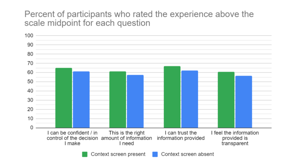
Including a context screen increased the percent of participants who (a) felt confident about making a system permission decision, (b) believed the experience provided the right amount of information, (c) believed the information provided was trustworthy, and (d) believed the information provided was transparent.
Figure 3. Ratings of confidence, amount of information, trustworthiness, and transparency among participants who saw the system permissions prompt with and without a context screen.

Figure caption: Values represent the percent of respondents who scored above the scale midpoint on a 5-point scale (see the appendix for verbatim survey items). For each survey question (x-axis), the differences between participants who saw the context screen (green bars) and those who didn’t (blue bars) was statistically significant.
Additionally, 73% of participants indicated that they preferred the design that included the context screen over the design that didn’t. Among users who preferred the option with the context screen, the top two reasons were that the context screen (a) made the system permission experience clearer and easier to understand and (b) better informed them to make a meaningful choice. These reasons were endorsed by 60% and 55% of participants, respectively.
Overall then, most participants preferred for a context screen to be included, despite the potential trade-offs with time and effort. Moreover, including a context screen actually led more participants to feel confident in their privacy decisions.
Conclusions
When presenting users with privacy choices, it can be challenging to strike the right balance between providing enough information to be helpful while not presenting so much information that it gets in the way of users easily accessing a product’s features. As we found in this research, there are some cases where standardized system permissions may not provide all of the context that users want. In those cases, providing context screens that include additional information can boost users’ confidence in their privacy decisions.
At Meta, we regularly include context screens with some system permissions if we believe their inclusion can help users make more confident privacy decisions. Importantly, context screens may not always be useful, and sometimes their inclusion could frustrate users if the information isn’t perceived as helpful or if users are particularly eager to access a feature; so it’s worth carefully considering and potentially researching the impact of context screens in different scenarios before using them. Regardless, context screens are a powerful tool that app designers can use to support users who are making certain privacy decisions.
Open questions
Are context screens more useful for certain people relative to others? For example, perhaps the additional information provided in context screens is particularly helpful for less tech savvy audiences or for people who use fewer apps and rarely encounter system permissions.
How much information is too much? There may be a point at which context screens include “too much” information, resulting in a sense of information overload among users. If so, that could lead context screens to be ineffective or even backfire (resulting in users feeling less confident in their decisions). Moreover, the right amount of information may vary based on factors like what specific system permission is being requested (ex: camera, microphone, location).
Beyond system permissions, are there other types of privacy decisions where context screens might be equally useful? System permissions are one type of privacy decision, and they were in focus for our research because their standardized format only permits apps to provide a relatively small amount of information on the system permission screen itself. But perhaps there are other cases where separating context information into a similar “pre-screen” could be a useful design pattern, even when the decision screen itself isn’t constrained (ex: other types of data permissions that aren’t system permissions, such as ad personalization decisions).
Answering these open questions requires additional research. We hope to inspire other organizations to pursue some of these possibilities given how promising context screens may be for improving users’ confidence in their privacy decisions.
