The metaverse is giving rise to a whole new interaction vocabulary – one that requires us to dramatically revise the existing conventions for screen-based interaction design.
 3D design pattern based on the XR prototype developed by MediVR
 In partnership with TTC Labs at Meta, Craig Walker Design and Research designed and facilitated a series of Design Jams in South Korea and Singapore to explore the intersection of policy and user experience (UX) in extended reality (XR). Policymakers and metaverse startups were brought together to explore a range of scenarios and challenges, collaborating on sketches, storyboards and improvised polystyrene props.
The output of the Design Jams was a set of 3D prototype solutions. These prototypes were then used as the basis for UX design patterns – a collection of animated immersive user interactions.
The resulting prototypes and design patterns revealed to us three emerging elements of interaction design for the metaverse: object-based user interfaces, social dynamics and place.
These core elements reflect particular qualities of immersive experiences – qualities that define the metaverse and make it distinct from web 2.0 interfaces and screen-based experiences.
To understand how to craft intuitive augmented and virtual reality experiences, we need to consider the possibilities and limitations introduced by each of these elements.
Object-based user interfaces (UIs)
The current state of interaction design has been refined to account for different devices and specifications — screen sizes, operating systems, internet speeds, user contexts. But designing for the metaverse requires us to think more broadly than this, considering embodied qualities such as place, social presence and immersion.
So how do we translate the order, hierarchy and UX logic of conventional screen-based design into the 3D immersive spaces of the metaverse?
In many of the prototypes developed during the Design Jams, we noticed the use of familiar objects as functional interface elements, with participants leveraging their real-world meanings to produce intuitive and easily understood interfaces.
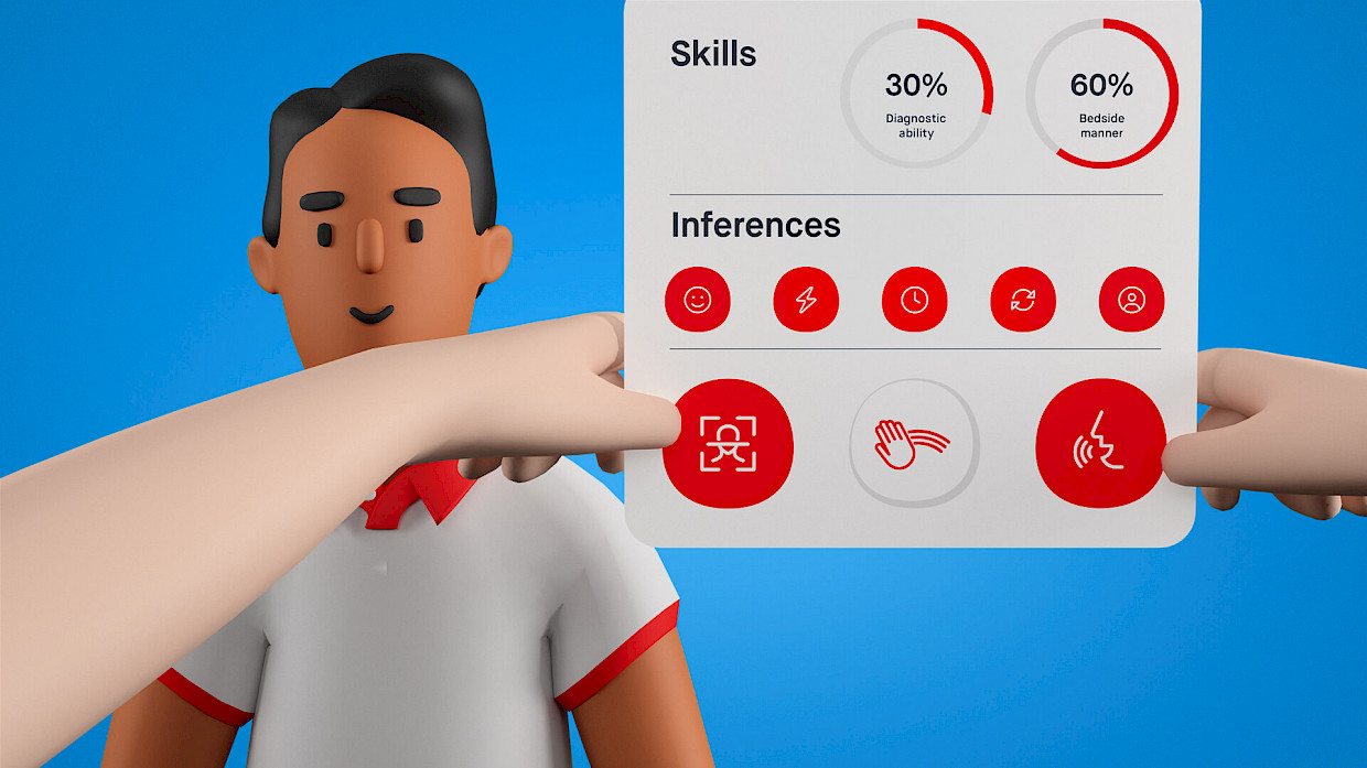
One example of this was developed by My Meta Farm, a Vietnamese startup which has created a metaverse world for socializing, gaming and creating. To address the privacy concerns of their users around the sharing of body-based data, they proposed a set of Privacy Accessories: wearable objects that can disable certain data types. Each accessory corresponds to the part of the body from which data is captured — sunglasses for eye tracking, a face mask for facial data and gloves for hand tracking.
 Design pattern based on My Meta Farm’s prototype
 These privacy accessories take abstract forms of data collection and tie them directly to the body, allowing people to easily understand and act on their privacy preferences in a physical way.
They become particularly relevant when we consider the other key interaction elements contemplated below: social dynamics (namely, the actions of other users within the metaverse) and place (encompassing the different platforms, worlds, vendors and spaces people can move between).
Both of these elements can create rapid, frequent shifts in context – changes where standard approaches to data privacy, such as notifications, could introduce unnecessary amounts of friction. My Meta Farm’s solution allows people to easily navigate these different contexts in a frictionless and intuitive way.
Another interesting aspect of the wearable Privacy Accessories is the way in which they allow people to signal their privacy preferences to other users. For example, a service representative would immediately be aware of someone’s privacy preferences based on their appearance, adjusting their behavior accordingly.
To assist people to understand how their preferences affect their outward presentation, part of My Meta Farm’s solution included a Privacy Mirror: a virtual mirror that reflects their avatar’s appearance. This is introduced alongside the Privacy Accessories, prompting people to try on various items and get a sense of how they will impact their appearance within the metaverse.
Similar to the accessories themselves, the mirror is a clear metaphor that provides people with an intuitive way of understanding how their privacy preferences impact their digital selves. It is interesting to note the universality of these objects across cultures, for example, what would privacy accessories look like in cultures in which the face is obscured in public places? Or cultures where lack of eye contact is a sign of disrespect?
Social dynamics
At its core the metaverse is a social space that allows for real-time, immersive interaction between different people. This creates an important shift in how we situate and understand people’s experiences, moving from an idea of users as individuals to people that form part of a social matrix.
This shift immediately introduces a range of secondary social considerations such as social expectations, customs and group dynamics. These interconnected and nuanced social scenarios create new user requirements that are not fully addressed by our existing interaction templates and design patterns.
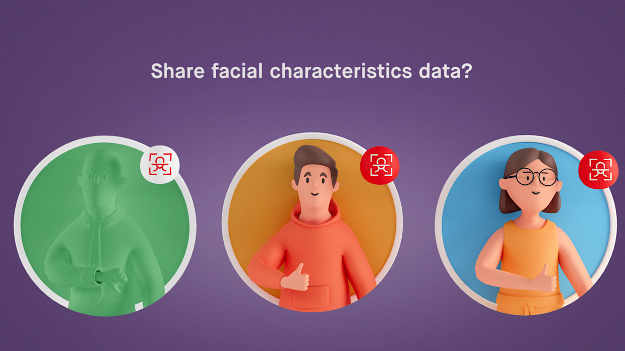
BuzzAR is a startup from Singapore whose Pop-Up Metaverse allows people in public spaces to generate avatars based on their facial features. Going into the Design Jams, a primary challenge for BuzzAR was enabling individual consent within the group context of Pop-Up Metaverse — inviting all users to participate in the experience, even those that withhold their consent.
 Design pattern based on BuzzAR’s prototype
 Screen-based interaction modes have grown out of solving for individual or abstracted groups of users. Within these current approaches, the simplest solution might be to deny the participation of a withholding individual. But such a strategy breaks the shared social experience.
If the metaverse is to feel embodied, fluid and social, we need to solve for groups of people in a virtual space together. To address this, BuzzAR proposed the use of simple, universal gestures — in this case a thumbs up or thumbs down — which people could use to signal their preferences.
To provide people with full control over their experience, there was no fixed decision period, allowing people to opt in or out at any time.
Another dimension to BuzzAR’s solution was the creation of a defined zone in which people must enter to engage with the product. This is especially important in public spaces where there is an increased risk of accidental data capture, particularly with vulnerable groups.
Place
Place forms the context in which social interactions occur, both online and off, playing a central role in defining the rules and expectations of social engagement.
Metaverse spaces are no different.
As the metaverse grows and evolves, people will be able to move seamlessly between different places — traversing platforms, worlds and locations, each with their own social context and rules. And while we can learn a lot from the gaming industry about the order and structure of immersive environments, the metaverse is introducing new considerations in utility, real-time interaction and aesthetics.
One of the privacy concerns people have in these environments is the feeling of being watched and monitored — a phenomenon known as the hidden camera effect.
This was one of the potential privacy concerns Singaporean startup Smobler identified when building a virtual metaverse campus. Their design challenge centered on students being unsure as to whether their conversations could be overheard by other users or captured by the platform.
 Design pattern based on Smobler’s prototype
 Smobler’s proposed solution is a feature that allows people to create Privacy Domes — physical bubbles that designate the privacy levels of conversations taking place within them.
On creating a dome, people have the option to set their desired level of privacy — public, semi-private or private — each of which is signaled to other students via the color of the dome.
What’s interesting about Smobler’s solution is that it takes implicit social cues — which are crucial to orienting ourselves in certain situations but easily taken for granted — and makes them an explicit feature. The Privacy Dome shows how, in immersive environments, clear signals can enable people to unambiguously set the terms of social engagements and allow others to adjust their behavior accordingly.
Key takeaways on crafting intuitive interactions
The design considerations in this article highlight the complex and interdependent relationships at play in XR.
But while XR environments can be more complex than previous digital experiences, they create the opportunity for novel interactions that are just as intuitive, if not more so, than their 2D counterparts.
To do this we need to rethink our approach to interaction design. This means replacing the templated, patterned and modular approaches that have been developed and refined for web 2.0 contexts with a deeper consideration of object-based UIs, social dynamics and place.
This is not only important in enabling us to design for optimal user experiences but also in expanding the limits of our cultural imagination, envisaging and building a metaverse that redefines the limits of our digital selves.
